
When I'm going into "project mode" at Infiniroot, it is always nice to have a visual representation of the current status. Whether this status is a single task or the whole project, it helps to quickly interpret how far we've come and how long the remaining road still is.
In Google Sheets, there is a nice way how to create such a simple "progress bar", using the SPARKLINE function. This function uses a value of a field and fills the field with a color - depending on the amount of the selected value and how this value is represented in between given min and max values.
Sounds complicated when writing it down, but by looking at a practical example this turns out to be not complicated at all:
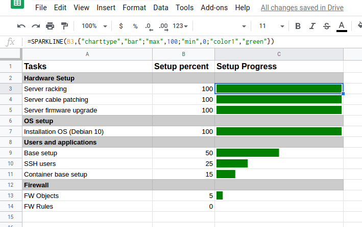
In this example the selected field (C3) used to represent the task progress. It uses the following formula:
=SPARKLINE(B3,{"charttype","bar";"max",100;"min",0;"color1","green"})
B3 in this case is the field value which SPARKLINE should use. The value of this field is set to 100, which represents the task completeness in percent. 100% of course means that this task was finished. SPARKLINE now compares this value (100) with the min and max values in its function settings. As the value (100) is the same as its defined max (100), the field C3 is fully filled with the progress bar.
Further down in row 9 another example shows up, where the task "Base setup" was completed at 50% (value of B9). The same formula (adjusted for the field value of course) automatically creates a progress bar filling up exactly half of the field C9.
Note: The idea to use SPARKLINE was found on a Reddit post. Actually the very first time I found something useful on Reddit... ;-)
The SPARKLINE function can also be used to show a progress bar of all tasks combined. As the example above shows, once the percentage of a task is known, it's pretty easy to create the progress bar. Speaking in terms of the whole project the big question is: How are all tasks calculated together?
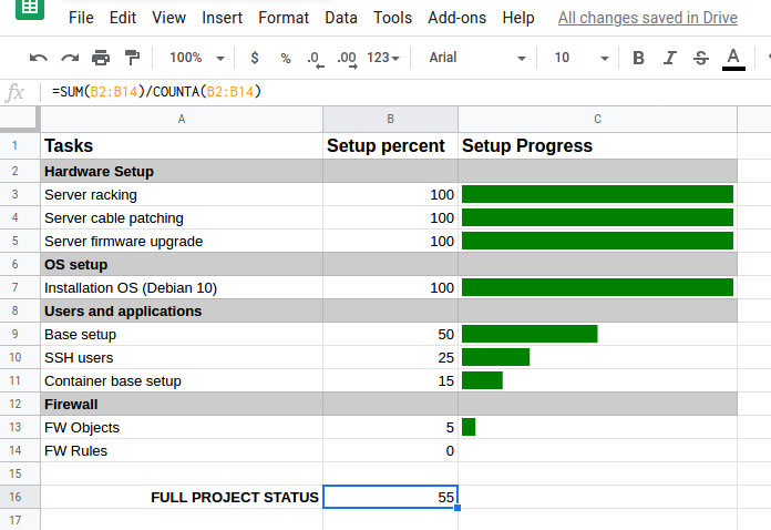
A simple way (without setting weights on the tasks) is to create a SUM of all percentage values and divide the sum by the number of fields. In order to automatically get the number of fields, the function COUNTA can be used. This counts the numbers of fields which contain a value; empty fields (in this case category rows 2, 6, 8 and 12) are ignored.
=SUM(B2:B14)/COUNTA(B2:B14)
This results in an average percentage:
Now that the project has a (again, very simplified!) overall progress percentage, this value can be used to create a status progress bar across the whole project (here with a red color):
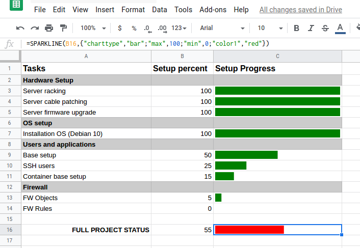
The project progress in the above example shows some representation of the project. But the representation is only correct if all tasks use the same resources, for example the same amount of time to complete.
In order to fine-tune the whole project progress calculation, a "weight" value per task is needed. In the example below, the "Time" column is used to specify a weight on each task. Or explained differently: How time consuming is each task?
By using the SUMPRODUCT formula, values of a range (B2:B14) can be multiplied with corresponding values of another range (C2:C14). The sum of all of these multiplications (hence the name SUMPRODUCT) can be divided by the sum of the weight (total time) prepared in B16:
=(SUMPRODUCT(B2:B14,C2:C14))/B16
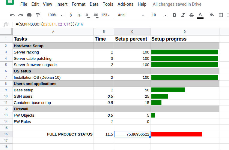
The full project status is now at 75% - much higher than the previous 55% without task weights. This is a much more realistic project progress representation as the tasks more time consuming are weighing higher on the calculation.
With a little bit of additional trickery the color used in the progress bar can be set to change automatically, depending on the progress. Within the SPARKLINE formula, an additional if clause can be defined. In the following example, the SPARKLINE formula of the full project status progress bar (in D16) is adjusted:
=SPARKLINE(C16,{"charttype","bar";"max",100;"min",0;"color1",IF(C16>79,"green",IF(C16>49,"yellow","red"))})
Note the bold highlighted IF(.....) clause. Instead of simply defining a single colour, the colour is now defined depending on the current value of C16. If the value in C16 is higher than 79, meaning the full project was completed 80% or more, the progress bar will appear in green. If the value of C16 is between 49 and 80, meaning the full project progress is currently 50-79%, the progress bar will appear in yellow. All other values, not matching the if comparisons before, will create a progress bar in red.
But pictures do show more than words:
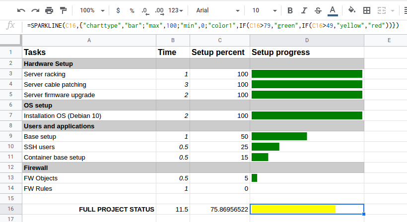
As the current full project status is at roughly 75%, the bar automatically appears in yellow - exactly as defined in the upper formula.
As mentioned by L2D2 in the comments below this article, the "min" option actually doesn't work. Taking a closer look at the SPARKLINE documentation, a "max" option is available for a bar chart type, however no min option exists. Changing the min value to something higher than zero does not change anything in the progress bar - it has no effect.
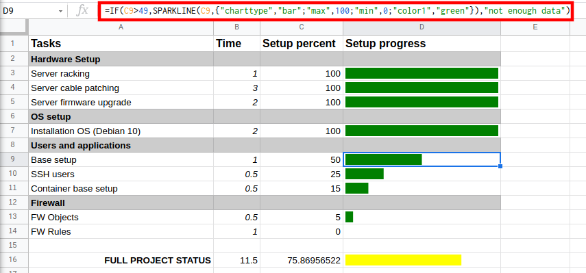
However if you need to use some kind of "minimum value" before the progress bar starts showing up, there's a trick using the IF function (a bit similar to the example above using different colours on the progress bar).
In the following example, the relevant value (in C9) for the SPARKLINE progress bar (in D9) is looked at. If the value is above 49, then the SPARKLINE function will be used, creating the progress bar:
=IF(C9>49,SPARKLINE(C9,{"charttype","bar";"max",100;"color1","green"}),"not enough data")
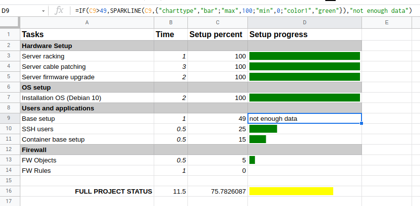
However if the value is not above 49, just a text "not enough data" will show up instead of a progress bar:
As mentioned in the comments below this article, some users experience problems using commas (,) in the functions and can prevent the progress bars to create. This is due to a localization/country setting in Google Sheets: non-english locales may detect the commas in the functions as error. To fix this, change the locale (country) settings of the Spreadsheet.
With the Spreadsheet opened in the browser, click on File in the Google Sheet menu (not the browser's menu!) and select "Spreadsheet settings". Here select a country with an English locale, in my case I used "United States":
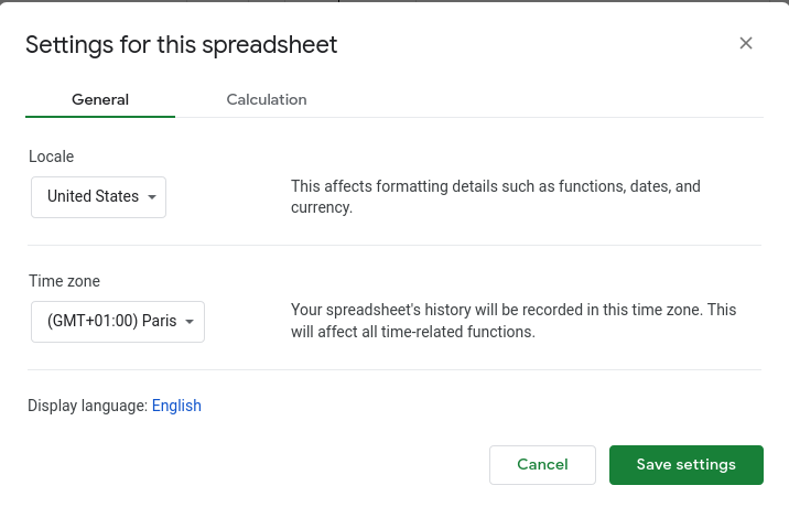
After saving the settings, the functions should work with commas.
ck from Switzerland wrote on Feb 17th, 2022:
Hi Rich. It should be possible by creating a button in Google Sheets and use a function which increases the value of a cell. Based on that cell you can use the progress bar.
Rich from Adelaide, South Australia wrote on Feb 17th, 2022:
Hello! Thanks for providing this awesome formula. Do you know if it's possible to tweak it so that instead of using figures like 50,60,70 etc to represent the % a series of "checkboxes" can be use? I.e, By clicking a checkbox the bar can progress by a certain percentage. So if I wanted to have 10 checkboxes equalling 10% each, once all 10 are checked the status bar shows full at 100%. Cheers :)
ck from Switzerland wrote on Aug 27th, 2021:
Hi Andy. Unfortunately adding text into the same field as the SPARKLINE formula does not seem to work.
Andy from United States wrote on Aug 27th, 2021:
Is it possible to overlay text within the cell of the progress bar?
Claudio Kuenzler from Switzerland wrote on Apr 14th, 2021:
L2D2, looking at the official documentation of SPARKLINE, it seems that there is actually no "min" option defined, at least not for bar charts. However you can use a trick and enforce a "minimum" value by using an IF function. I will add such an example to the article shortly.
L2D2 from wrote on Apr 14th, 2021:
Thanks for the article, really helpfull! The minimum value is just not working for me, this value is always 0. I would like to have a higher minimum value for the start of the progressbar. Do you have a solution for this?
Mac Sullivan from United States wrote on Jan 31st, 2021:
I really appreciate you taking the time to write this up. I am using a spreadsheet for a character sheet for a table top role playing game (TTRPG) I am creating from scratch, and I'm using this example to show skill point values on a scale. It works fantastically, and it's easy to use. Note to users, I recommend the use of hexadecimal color codes if you want to use a specific color shade, as the color names do not always match the shade on the program you are using, for example, in Google Sheets (Google's "purple" is actually lighter in shade that using "purple" in the function, and instead #9900ff).
Thank you much, and have all of yourselves a great day.
ck from Switzerland wrote on Jan 9th, 2021:
Lalla, thanks for your comment. You could try to refer to the same column where you want the bar. However I don't know if it works to define a value AND create a SPARKLINE at the same time. Try and error I guess ;-)
Lalla from So. California wrote on Jan 8th, 2021:
Great work! But is there a way to accomplish this using the column with the Sparkline bars? Our variables are percentages, dollars, and whole numbers so we can’t use the column as shown.
Claudio Kuenzler from Switzerland wrote on Jan 5th, 2021:
Hi saeed! Yes, it is possible! I just added a new example (Automatically using different colours based on progress) in the article which shows how to do this. Enjoy!
saeed from iran wrote on Jan 5th, 2021:
thanks a lot, I used the script and there was no problem using "".
now I'm looking for a way to change the color depends on if
as an example if the setup percent is less than 25 then color change to yellow
is it possible?
Luiz from Manaus, Brazil wrote on Dec 17th, 2020:
Hey, The Google Sheets isn't accepting the options separated with ",", it is using \ as key-value separator, example:
=SPARKLINE(B2,"charttype"\"bar";"max"\100;"min"\0;"color1"\"green")

AWS Android Ansible Apache Apple Atlassian BSD Backup Bash Bluecoat CMS Chef Cloud Coding Consul Containers CouchDB DB DNS Database Databases Docker ELK Elasticsearch Filebeat FreeBSD Galera Git GlusterFS Grafana Graphics HAProxy HTML Hacks Hardware Icinga Icingaweb Icingaweb2 Influx Internet Java KVM Kibana Kodi Kubernetes LVM LXC Linux Logstash Mac Macintosh Mail MariaDB Minio MongoDB Monitoring Multimedia MySQL NFS Nagios Network Nginx OSSEC OTRS Office PGSQL PHP Perl Personal PostgreSQL Postgres PowerDNS Proxmox Proxy Python Rancher Rant Redis Roundcube SSL Samba Seafile Security Shell SmartOS Solaris Surveillance Systemd TLS Tomcat Ubuntu Unix VMWare VMware Varnish Virtualization Windows Wireless Wordpress Wyse ZFS Zoneminder