
When working with (HTML) forms, depending on the kind of input, a slider makes perfectly sense to select a value within a certain range. At Infiniroot we use sliders on our hosting order form to specify the server's capacity but there are many other use cases.
While working on a new project for a customer, which includes a HTML form, we came across noUiSlider. A much more responsive and configurable slider compared to the bootstrap slider from seiyria we've used before. But caution - there will be dragons! Although noUiSlider offers a few examples, the exact usage might not be very clear (at first).
To create a first noUiSlider example, the following resources are needed:
Upload these files to your web hosting or if you have shell access or your own web server, download the resources from the public Git repository on Github:
mintp html # wget https://raw.githubusercontent.com/leongersen/noUiSlider/master/distribute/nouislider.js
mintp html # wget https://raw.githubusercontent.com/leongersen/noUiSlider/master/distribute/nouislider.min.css
Both resources (JavaScript and CSS) need to be loaded in the <head> section of the HTML page. To show a very basic example:
<!DOCTYPE html>
<html>
<head>
<link href="nouislider.min.css" rel="stylesheet">
<script src="nouislider.js"></script>
</head>
<body>
To create a slider, it is important to understand that each slider is placed where its own div id is defined. The div layer shouldn't have any content, it's basically just the definition of the div layer:
<div id="slider"></div>
In other words: The div layer is the placeholder for the slider.
The slider itself is defined as a JavaScript snippet using the same id as the div layer (here: slider):
<script>
var slider = document.getElementById('slider');
noUiSlider.create(slider, {
start: 1,
range: {
'min': 0,
'max': 8
}
});
</script>
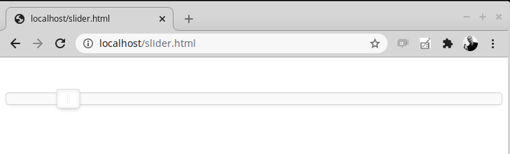
In this example, a slider (identified by the unique name 'slider') is created. Each slider has a unique name. There are no limits how many sliders can show up on the same HTML page, as long as they all have their own unique name.
A basic range from 0-8 is defined for this slider, the slider position itself should start at value 1. Finish the HTML page with closing </body> and </html> and voilà, the slider is alive:
So far so good, but at the very begin of this article we've mentioned
that noUiSlider is highly configurable. So let's check out some of the
configuration options.
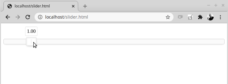
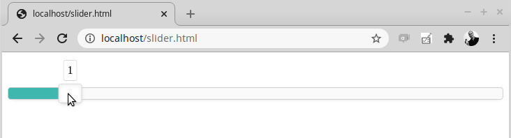
The option tooltips can be described as an on-top layer above the current slider position. The currently selected value will be shown. This is especially helpful to end users to immediately see the selected value (or range). To enable this, simply set tooltips to true in the JavaScript creation of the slider:
<div id="slider"></div>
<script>
var slider = document.getElementById('slider');
noUiSlider.create(slider, {
start: 1,
tooltips: true,
range: {
'min': 0,
'max': 8
}
});
</script>
The slider should now show the current value:
If you have configured tooltips but the tooltips don't show up, it doesn't forcibly mean you have made an error. The slider could look like this:
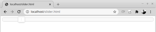
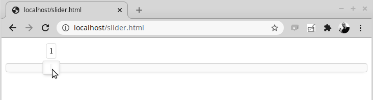
The reason for this is that, as mentioned above, tooltips is using an "on-top layer", which requires to have a certain margin (distance) from the browser top. In this case, the slider is simply too close to the top of the HTML page. Placing the slider slightly lower does the job. You could use fancy margin-top in CSS or even simpler, just use an empty paragraph:
<p> </p>
<div id="slider"></div>
<script>
var slider = document.getElementById('slider');
noUiSlider.create(slider, {
start: 1,
tooltips: true,
range: {
'min': 0,
'max': 8
}
});
</script>
And the tooltips will be shown.
By default, noUiSlider handles the whole slider range as a "float", meaning a number with decimals. See the animated gif from the working tooltips example above. Now there's two ways to solve this, but only one will be a real solution.
The first way is to tell the slider to increase the value in steps. If such a step is a full number (such as 1), the value will increase by 1.00 instead of small decimals counting up. The relevant config option is step followed by the value:
<div id="slider"></div>
<script>
var slider = document.getElementById('slider');
noUiSlider.create(slider, {
start: 1,
step: 1,
tooltips: true,
range: {
'min': 0,
'max': 8
}
});
</script>
This does the job of only getting an even number but still has a few disadvantages: The slider doesn't move fluidly anymore (due to the steps) and the number is in fact still a float with decimals:

To remove the decimals and only show full numbers (integers), an additional resource wNumb is required. Download wNumb.js or wNumb.min.js and place it with the other resources.
mintp html # wget https://raw.githubusercontent.com/leongersen/wnumb/master/wNumb.min.js
This resource needs to be loaded in the <head> section of the HTML page, too:
<!DOCTYPE html>
<html>
<head>
<link href="nouislider.min.css" rel="stylesheet">
<script src="nouislider.js"></script>
<script src="wNumb.min.js"></script>
</head>
<body>
Now the slider is able to use an internal formatting, using the wNumb function:
<div id="slider"></div>
<script>
var slider = document.getElementById('slider');
noUiSlider.create(slider, {
start: 1,
step: 1,
tooltips: true,
range: {
'min': 0,
'max': 8
},
format: wNumb( { decimals: 0 })
});
</script>
wNumb offers a couple of different options itself, but the relevant option for this example is to set the decimals to 0 (no decimals for numbers). And the slider now only shows integers:
The mentioned format setting in combination with wNumb offers a couple of formatting options, including adding text:
<div id="slider"></div>
<script>
var slider = document.getElementById('slider');
noUiSlider.create(slider, {
start: 1,
step: 1,
tooltips: true,
connect: 'lower',
range: {
'min': 0,
'max': 8
},
format: wNumb( { decimals: 0, suffix: ' kg' })
});
</script>
In this example, the text " kg" is defined as suffix behind the value. This will now show up in the slider's tooltips, too:
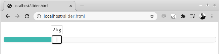
Imporant note: The text suffix (or prefix) is not only used to be displayed in the tooltips layer, it will be effectively a part of the final value of this slider!
Of course, the tooltips option is already very helpful, but by showing the actual selection (or the value part of the whole range) in another colour would immediately highlight how low or how high the current selection is. This can be achieved by using a background colour for the selection and is actually already defined by default in noUiSlider - it just needs to be enabled by using the connect option.
In the following example, the connect value is set to lower. This means that the background colour should be active from the lower part of the range (0 in this case) until the current position of the slider:
<div id="slider"></div>
<script>
var slider = document.getElementById('slider');
noUiSlider.create(slider, {
start: 1,
step: 1,
tooltips: true,
connect: 'lower',
range: {
'min': 0,
'max': 8
},
format: wNumb( { decimals: 0 })
});
</script>
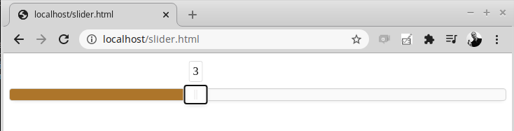
The current CSS implements a cyan-like colour for the background. But this colour can be changed. The relevant CSS style is called noUI-connect. To keep your files update-able, a separate CSS should be defined (which in most cases should already exist in your own website).
The additional CSS is defined after the noUISlider's CSS resource in the <head> section of the HTML page:
<!DOCTYPE html>
<html>
<head>
<link href="nouislider.min.css" rel="stylesheet">
<link href="customstyle.css" rel="stylesheet">
<script src="nouislider.js"></script>
<script src="wNumb.min.js"></script>
</head>
<body>
And in customstyle.css the noUI-connect class is defined. As it is loaded after the noUiSlider CSS, it will overwrite existing classes.
mintp html # cat customstyle.css
/* Form Sliders */
.noUi-connect, .progress-bar {
background-color: #AD752A;
}
The background of the slider now shows the new colour:
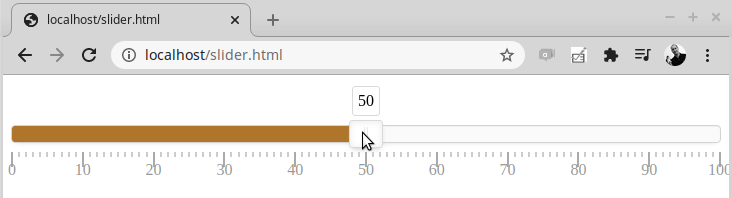
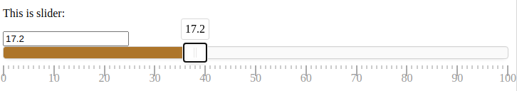
In most cases a slider simply going from value to value is self-explanatory. But in some cases (for example conversions and calculations), a ruler might help. Such a ruler is called pips in noUiSlider and can be added as an option in the slider's definition.
The pips option supports multiple ways (methods) of showing a ruler and their small vertical lines, called pips. See the documentation to find out the differences between the methods.
In the following example, a slider is created with a range from 0-100 and the pips method is set to values to show numbers as defined by the values array:
<div id="slider"></div>
<script>
var slider = document.getElementById('slider');
noUiSlider.create(slider, {
start: 50,
step: 1,
tooltips: true,
connect: 'lower',
range: {
'min': 0,
'max': 100
},
pips: {
mode: 'values',
values: [0, 10, 20, 30, 40, 50, 60, 70, 80, 90, 100]
},
format: wNumb( { decimals: 0 })
});
</script>
The slider now looks like a scale:
In one of the previous examples, format in combination with wNumb function was used to show an integer (= number without decimals) instead of a float number. But wNumb can do more than just format the value, it can do calculations, too.
Now that a "scale" was created, we can create a practical example and do a conversion from kg to lb. To do calculations, the encoder function inside wNumb can be used. The current selected value of the slider is saved as "x" and "x" is then divided by 2.20462262185 (the formula is 1kg = 2.20462262185 lb) and returned as the final output:
<div id="slider"></div>
<script>
var slider = document.getElementById('slider');
noUiSlider.create(slider, {
start: 50,
step: 1,
tooltips: true,
connect: 'lower',
range: {
'min': 0,
'max': 100
},
pips: {
mode: 'values',
values: [0, 10, 20, 30, 40, 50, 60, 70, 80, 90, 100]
},
format: wNumb( { decimals: 1, encoder: function(x) { return x / 2.20462262185; }, suffix: ' lb' })
});
</script>
The slider can now used to immediately calculate the weight in lb based on the current position of the scale (kgs):
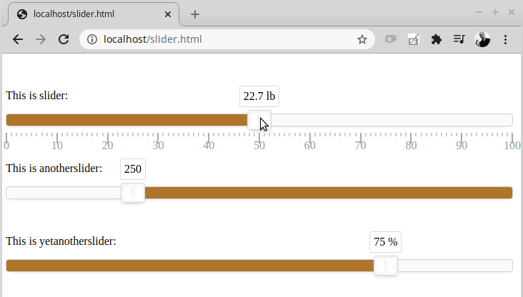
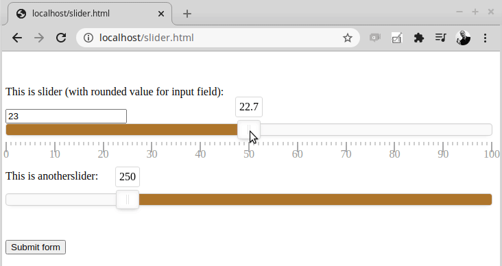
As mentioned at the beginning of this article, there is no limit on how many sliders can be created on the same HTML page. The only requirement is: Each slider needs its own unique id. By following that rule, multiple sliders can be created on the same page.
In this example, three sliders are created: slider, anotherslider, yetanotherslider. Each slider has slightly different settings:
<p>This is slider:</p>
<div id="slider"></div>
<p> </p>
<p>This is anotherslider:</p>
<div id="anotherslider"></div>
<p> </p>
<p>This is yetanotherslider:</p>
<div id="yetanotherslider"></div>
<script>
var slider = document.getElementById('slider');
var anotherslider = document.getElementById('anotherslider');
var yetanotherslider = document.getElementById('yetanotherslider');
noUiSlider.create(slider, {
start: 50,
step: 1,
tooltips: true,
connect: 'lower',
range: {
'min': 0,
'max': 100
},
pips: {
mode: 'values',
values: [0, 10, 20, 30, 40, 50, 60, 70, 80, 90, 100]
},
format: wNumb( { decimals: 1, encoder: function(x) { return x / 2.20462262185; }, suffix: ' lb' })
});
noUiSlider.create(anotherslider, {
start: 250,
step: 1,
tooltips: true,
connect: 'upper',
range: {
'min': 0,
'max': 1000
},
format: wNumb( { decimals: 0 })
});
noUiSlider.create(yetanotherslider, {
start: 75,
step: 1,
tooltips: true,
connect: 'lower',
range: {
'min': 0,
'max': 100
},
format: wNumb( { decimals: 0, suffix: ' %' })
});
</script>
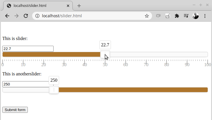
Right now all the example sliders only do one thing: They show the current selected value to the user (using tooltips). But in most cases, something should be done with the selected value. When using HTML forms, adding a slider is not enough. How would the form know that the slider is part of the form? For this a form input field needs to be defined. This input field will be updated with the current value of the slider. To do this, additional JavaScript functions are necessary.
In the following example, standard input fields (text fields) are defined just before the slider divs:
<form name="infiniroot" action="post.php" method="POST">
<p>This is slider:</p>
<input type="text" id="weight" name="weight" placeholder="xx lb">
<div id="slider"></div>
<p> </p>
<p>This is anotherslider:</p>
<input type="text" id="apples" name="apples" placeholder="n">
<div id="anotherslider"></div>
<p> </p>
<input type="submit" value="Submit form">
</form>
The JavaScript part where the sliders "slider" and "anotherslider" is created (noUiSlider.create) remains the same as in the previous example. However after this, an additional <script> block is needed (after the noUiSlider.create functions) to retrieve the values from the sliders and live-update the corresponding input fields:
<script>
var weightInput = document.getElementById('weight');
slider.noUiSlider.on('update', function (values, handle, unencoded) {
var weightValue = values[handle];
weightInput.value = weightValue;
});
weightInput.addEventListener('change', function () {
slider.noUiSlider.set([null, this.value]);
});
var applesInput = document.getElementById('apples');
anotherslider.noUiSlider.on('update', function (values, handle, unencoded) {
var applesValue = values[handle];
applesInput.value = applesValue;
});
applesInput.addEventListener('change', function () {
anotherslider.noUiSlider.set([null, this.value]);
});
</script>
The input fields, where a human usually would enter a text or a number, now "magically" change the content:
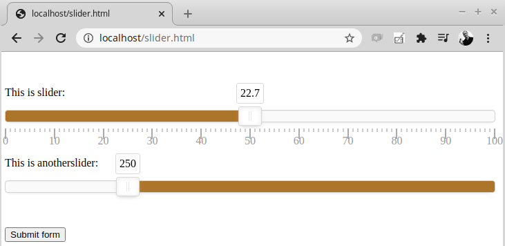
Displaying the input field value is helpful to verify that the current slider value is actually used for the input field. But to an end-user this may look confusing. The end-user is already able to see the selected slider value with the tooltips. To solve this, is probably the easiest task of this whole article: Simply set the input field type as hidden instead of text:
<form name="infiniroot" action="post.php" method="POST">
<p>This is slider:</p>
<input type="hidden" id="weight" name="weight" placeholder="xx lb">
<div id="slider"></div>
<p> </p>
<p>This is anotherslider:</p>
<input type="hidden" id="apples" name="apples" placeholder="n">
<div id="anotherslider"></div>
<p> </p>
<input type="submit" value="Submit form">
</form>
And the input field is not showing up in the browser:
When the input value shows NaN then there was a problem of updating the relevant input field with the value from the slider. This can be seen if the input fields are not hidden or if the form was submitted (submitted data can be seen in the browser console).
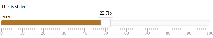
A possible reason is that input fields cannot handle text prefix and suffixes, coming from the wNumb formatting. In this case make sure no remove any text formatting in wNumb. Remove the text suffix (here "lb") and it should work:
If for some reason your form needs to work with integers rather than floats, the updated input field can dynamically use a rounded number of the current selection. In this example, the "weight" input from slider named "slider" is updated with only full lb's. To achieve this, the final value is rounded using the Math.round() function:
<script>
var weightInput = document.getElementById('weight');
slider.noUiSlider.on('update', function (values, handle, unencoded) {
var weightValue = values[handle];
weightInput.value = Math.round(weightValue);
});
weightInput.addEventListener('change', function () {
slider.noUiSlider.set([null, this.value]);
});
var applesInput = document.getElementById('apples');
anotherslider.noUiSlider.on('update', function (values, handle, unencoded) {
var applesValue = values[handle];
//weightInput.value = Math.round(weightValue);
applesInput.value = applesValue;
});
applesInput.addEventListener('change', function () {
anotherslider.noUiSlider.set([null, this.value]);
});
</script>
To better show the rounding behaviour, the type of input field "weight" is set to "text" again, so it shows up in the browser:
Working with the noUiSlider is quite fun and impressive! The difficult part is to understand how to implement the sliders - especially understanding how to name them when using multiple sliders and in which order resources need to be loaded. Talking about this, loading resources: Some JavaScript based scripts (such as bootstrap) can be loaded at the end of </body> to increase page loading times. This is not possible with noUiSlider, the sliders simply won't work in this case.
Luberth from Nederland wrote on Oct 26th, 2021:
Hello
Nice explanation nouislider
Is it possible to turn off bar touch
Only slide by handles
No slide when bar touch is touched
https://github.com/ldijkman/ART-ESP32-Touch-TFT-Thermostat/tree/main/test/art_test_1/Remote_WiFi_Sense_Switch

AI AWS Android Ansible Apache Apple Atlassian BSD Backup Bash Bluecoat CMS Chef Cloud Coding Consul Containers CouchDB DB DNS Databases Docker ELK Elasticsearch Filebeat FreeBSD Galera Git GlusterFS Grafana Graphics HAProxy HTML Hacks Hardware Icinga Influx Internet Java KVM Kibana Kodi Kubernetes LVM LXC Linux Logstash Mac Macintosh Mail MariaDB Minio MongoDB Monitoring Multimedia MySQL NFS Nagios Network Nginx OSSEC OTRS Observability Office OpenSearch PHP Perl Personal PostgreSQL PowerDNS Proxmox Proxy Python Rancher Rant Redis Roundcube SSL Samba Seafile Security Shell SmartOS Solaris Surveillance Systemd TLS Tomcat Ubuntu Unix VMware Varnish Virtualization Windows Wireless Wordpress Wyse ZFS Znuny Zoneminder